AirportNAV
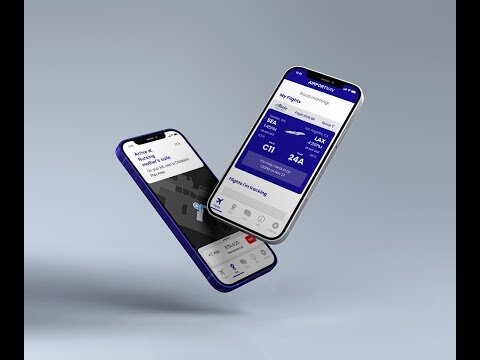
AirportNAV is an application for users who fly via airports, focusing on new moms who need an extra source of assistance.
In this project, I helped narrow down a solution for our target audience of new mothers by conducting user interviews and card sorts, analyzing our results, and creating prototypes.
Project duration: 9 months, completed June 2021
Team: Michele Chao, Jess Price, Taishi Hayakawa, Yeliz Simitci

AirportNAV Trailer
Challenge: How might we reduce stress and improve the experience within the SeaTac airport?
Target Audience
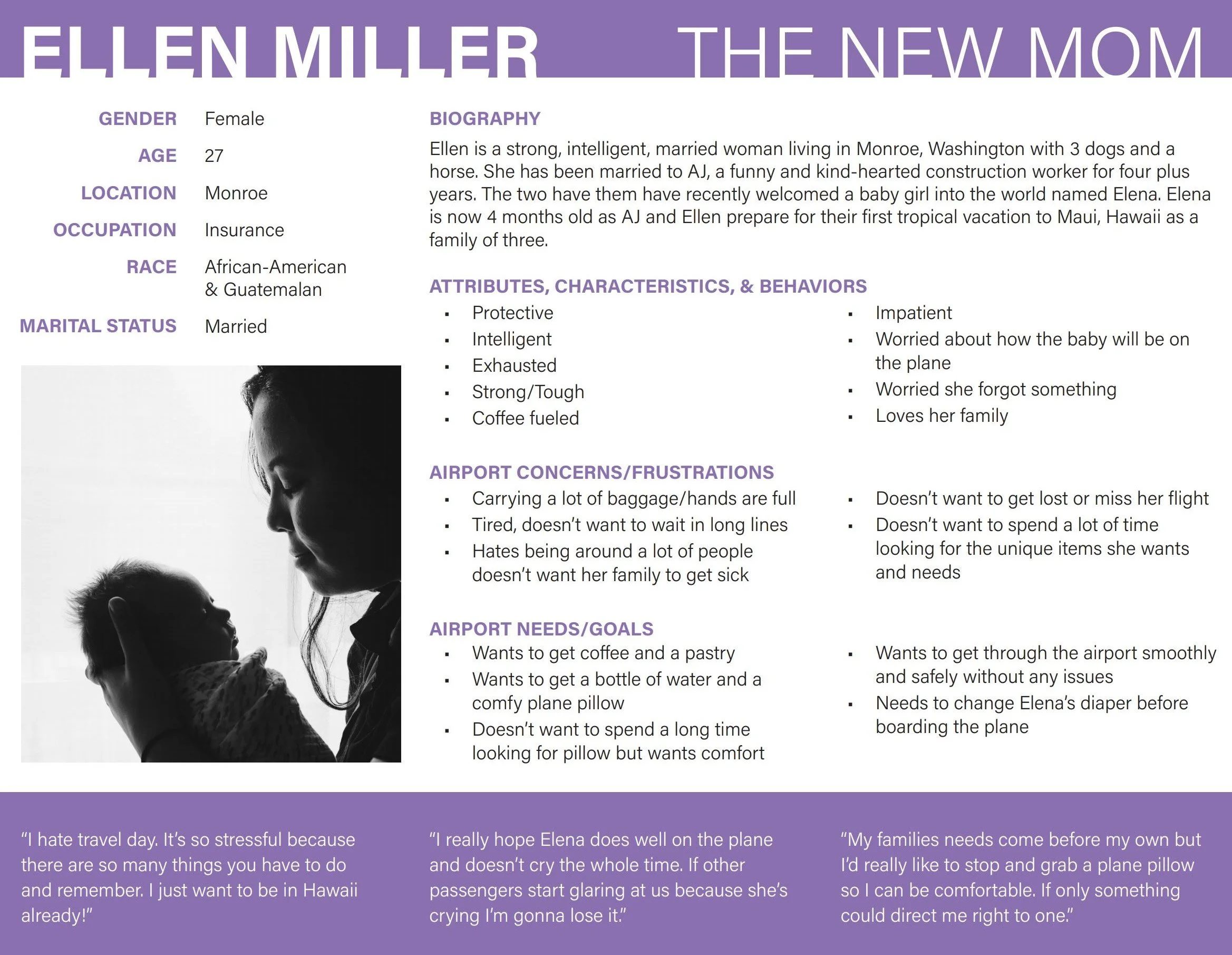
Our target audience is a new mother who struggles with navigating through the airport while managing her infant and her baggage, making sure she's prepared to clear security, and most of all, keeping track of time.

Why new moms?
Throughout our evaluation of our multiple personas, we found that new mothers have the most number of pain points while being the most sought out persona from our stakeholders and supporting faculty members.
Interview Insights
Nervous, hectic, and a little stressful were some of the words mentioned by our target audience when description how it was flying with their infant.
Under-packing and forgetting essential items & resources were mentioned 21x
Delays and issues with timing was another theme, also mentioned 21x
Info Architecture
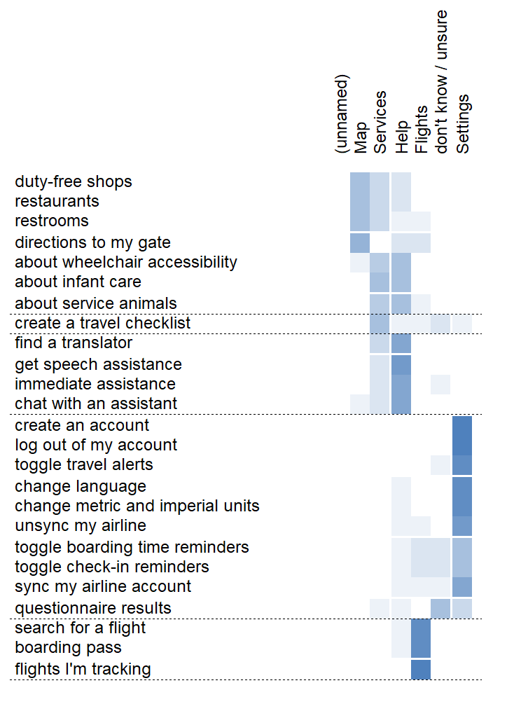
Our card sort directed the information architecture of our wireframe. We analyzed our item x item graph (below) and discovered that the "travel checklist" was controversial, in how participants categorized it. They were confused about what it was, so we decided to change the verbiage.
We invited this item with more emphasis in our usability sessions.

Usability Testing
Tasks assigned in each moderated testing sessions:
1. Ask user to add "extra clothes" to packing list
2. Ask user to start navigation to a nursing pod
3. Ask user to start navigation to their gate
The flowchart below shows the projected user flow before feedback.

Usability Testing Insights
• Some users moved to other tabs when looking for the packing list while the packing list was on the main flights tab that they're initially presented with
• All users successfully navigated to a nursing pod but none did so through selecting the "Suggested For You" icon in the map menu, but only through the "infant care" icon
• All users successfully navigated to their gate; some users moved back to the flights tab to find the button, some users selected "Your gate" under the map menu
Recommendations
Here are our recommendations based on the insights gathered from our usability sessions:
Move the packing list to another tab of the app as to not occupy the main flights tab with what’s not expected
Remove the suggestion of navigating to a nursing pod in the “Suggested For You” icon unless frequently selected